Monday, February 6, 2012

Media Bias: M.I.A's Message for America


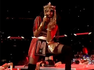
In my story's case, the media's bias could not be more obvious. On February 5th, British rapper, M.I.A, guest performed during the 2012 Super Bowl.  She grabbed the attention of millions of viewers as she gave cameras a middle finger gesture while stating, "I don't give a shit."

One media outlet, RT, published the article M.I.A gives America the middle finger.  This article carried out rumors that the female British rapper intentionally flipped off the cameras as a message to America.  The article states that M.I.A's actions were sparked after her latest video, Born Free, was banned from the U.S. due to scenes of graphic violence.

RT supported their article with a lot of M.I.A's history.  They mention her previous comments as well as events in her past that may have caused her to be bitter toward America.  It is no secret that M.I.A is an outspoken woman, but her headstrong nature gives the media an incentive to portray her as "a terrorist."  Her original "terrorist" comment was misinterpreted and her 2007 hit single, Paper Planes, was put on blast as a "politically-charged song" after her visa was denied by the U.S. government.  These speculations can be linked to various things, but it goes to show that the media has jumped to conclusions rather than facts. 

Although it was believed that M.I.A was trying to make a statement to the country, other media outlets published articles that suggested other reasons for her behavior.  USA Today's story, Was M.I.A.'s middle finger a pointed comment?, presents the idea that hip-hop performers are expect to be controversial and that she made a scene in order to gain publicity.  Paper Planes, gave her noteworthy attention.  USA Today wrote that some believe M.I.A planned the gesture because when she did it, she looked straight at the camera.  On the other hand, ABC News' article, M.I.A.'s Middle Finger was Caused by 'Adrenaline and Nerves', published that a close source to the rapper said M.I.A. never meant anything by the gesture, which was not planned, but caused by "'adrenaline and nerves.'"

On a side note, the media is also biased by dragging Madonna into the halftime show mishap.  USA Today's, Was M.I.A.'s middle finger a pointed comment?, questions Madonna's involvement by pondering the thought that she knew and had approved the gesture.  The article even goes as far as questioning if Madonna "put her up to it."

As you can see, the media has its way of portraying events in one favor or another.  The bottom line is that facts should be listed within a story and quotes can be included to support that story, but the writer should not show favor themselves.  This entire event and the mentioned articles are heavy with media bias.
Wednesday, January 18, 2012

WEBSITE LIKE & DISLIKE

MEDIA WEBSITES
WHAT I LIKE:  
USA Today is definitely one of my favorite online news sites.  The most attractive part of a website is it's layout and organization.  I love how this website is organized with tabs at the top, which navigate to specific news sections.  The best part about the website is how uncluttered it is.  There's still a lot of information and news throughout the web pages, but each section is grouped together.  It's very appealing and easy to read because the layout is well spaced out. 

The Huffington Post is also a very appealing online newspaper website.  I found that I liked how eye-catching the site's graphics are.  This website grabs your attention with its large, bold pictures and text.  Every story has a photo or video that grabs the reader's attention.  I definitely think that visuals can tell a story on its own; in this case, it makes the stories even more attractive and desirable to read.

    WHAT I DON'T LIKE:
    On the other hand, The Jacksonville News is not an attractive website to me.  I did not like anything about it's layout, design or organization.  I think that the site is bland and does not flow well.  I also feel like the site is too busy, mostly because content is not spaced out very well.  Overall, it looks out dated and boring. 


      GENERAL WEBSITES
      WHAT I LIKE:
      I, just like so many other people in the world, love Pinterest.  This site is set up perfectly.  Overall, it is pictures galore!  This site is so easy to navigate.  All you have to do is scroll through the ongoing page of pictures that have been re-posted, or re-pinned.  Of course this site is attractive.  It's mainly because of the series of enticing pictures.  As users hover their mouse over a picture, user friendly button options appear so the user can repin, like or comment on it.  The site also allows users to create boards so they can organize the photos they want to re-pin.  The entire site is very user friendly from its easy access buttons to the quick drop down menus.  Users can link to any part of the site with a quick click.

        WHAT I DON'T LIKE:
        We Heart It is another photo collecting website.  Unfortunately, this site is not as user friendly as Pinterest. This site does not display many photos on a single page.  This makes it a little more time consuming to browse through the photos.  Also, users have to download the "heart it" button to their toolbar.  Once it is downloaded, it is easy to begin "hearting" photos.  Lastly, the site is horrible about loading new photos when you opt to view the next page.  Instead, the majority of photos from the previous page reoccur on the newly loaded page, along with very few, new photos. 

          Media Blog Assignment: Rivera